






How to Apply Colour Psychology to Event Marketing
22 August 2019
Scritto da:
Colour Influences Decisions: Deliver Brand Experiences with Colour!
What colours do you associate with certain emotions? Unknowingly, we all link some hues to specific feelings, and that’s because we have subconscious reactions to colours. You can apply colour psychology to event marketing and make the most out or your brand activation or event by offering brand experiences with colour.
What is Colour Psychology?
First things first. Let’s start with a definition of the concept in question. Colour psychology is the study of hues as a determinant of human behaviour. According to Psychology Today, “the psychology of colour as it relates to persuasion is one of the most interesting - and most controversial - aspects of marketing”.
One of the reasons for this is the fact that many factors influence our perception of colours: our upbringing, experiences, personal preferences, cultural differences, context, etc. Therefore, many experts conclude colour perception is not a universal human experience.
However, there’s no doubt colour influences decisions. Even though our perception varies from culture to culture, Psychology Today also shared the conclusions of a study called Impact of Color in Marketing. In it, researchers explain that “up to 90% of snap judgments made about products can be based on colour alone (depending on the product)”.
Yellow: optimism, clarity and warmth
A colour chosen by brands such as Nikon, National Geographic or McDonalds, yellow is meant to convey optimism, clarity and warmth.
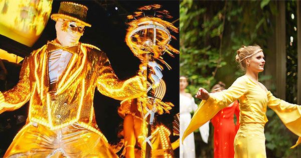
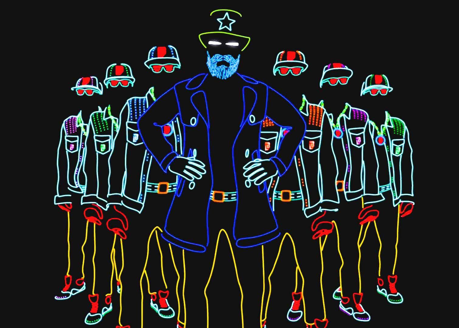
In the photo: LED Yellow Stilt Gentleman and Colour Stilt Walkers
This colour is also used by brands that aim for their target audience to remember their logo and message, as it normally helps people retain information. Associated to joy, energy and good humour, you can book entertainers who use this colour to stand out in an exhibition, quickly catch the attention of attendees at a trade show or make your guests remember your brand when the event is over.
Orange: friendliness, cheerfulness, confidence
A vivid colour used by brands such as Nickelodeon or Amazon, orange is generally perceived as a friendly colour. Also seen as loud and exotic, orange belongs to a palette of warm shades that communicate confidence and creativity.
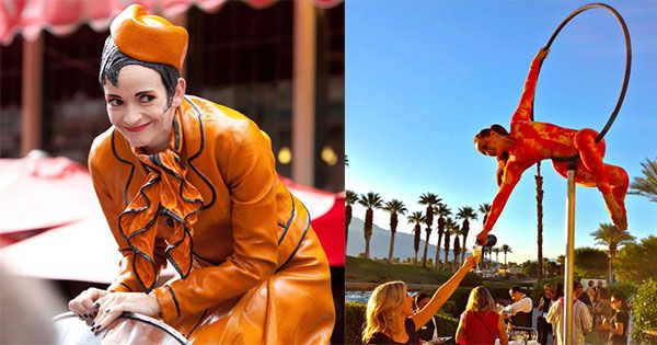
We highly recommend booking performers making use of orange if you’re looking for a friendly character to welcome guests to your party, an entertainer who hands out samples of products or a performer that quickly catch the attention of attendees at a trade show or exhibition.
Red: excitement, youthfulness, boldness
Extremely popular, red is the corporate colour of brands such as Kellogg’s, Coca-Cola or Nintendo. Linked to excitement, youthfulness and boldness, red is a primary colour that we generally associate to passion, power and, in some cultures, to happiness.
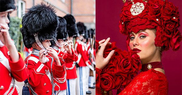
In the photo: Danish Youth Guard and Red Rose Hostess
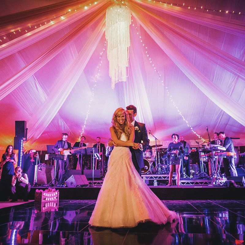
A colour that we at Scarlett Entertainment clearly love, you can book entertainers in red not only for brand activations, but also for special occasions such as romantic proposals, weddings and Valentine’s Day celebrations, but also if you’re looking for musicians that spread excitement and the desire to have a good time at Christmas parties, New Year’s Eve events, etc.
Purple/pink: creativity, imagination, wisdom
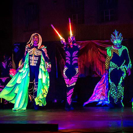
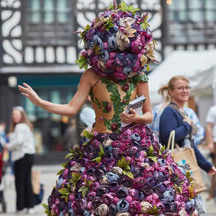
Generally associated with femininity, more and more brands tend to use purples and pinks. Among them, we can find T Mobile, Aussie, Taco Bell and, of course, Barbie. Purple and pink are colours that communicate creativity, imagination and wisdom. There are tones that we all perceive as delicate and sweet, which is the reason why it’s perfect to promote beauty brands at fashion shows or attract children’s attention at a shopping mall or festival, to name a few examples.
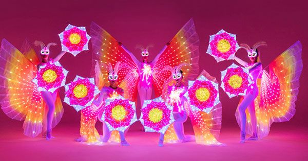
In the photo: LED Butterflies
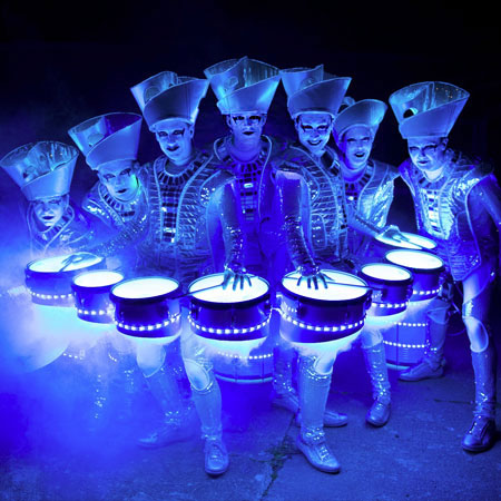
Blue: trust, harmony, strength
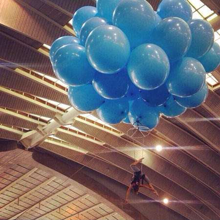
One of the favourite colours among both men and women, blue is generally associated with trust, harmony and strength. That’s the reason why brands such as Facebook, HP or Ford picked it as their corporate colour. It also represents unity and peace, which is why entities such as the UN or the EU also use blue for their logos and flags.
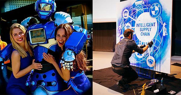
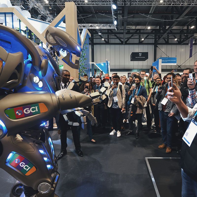
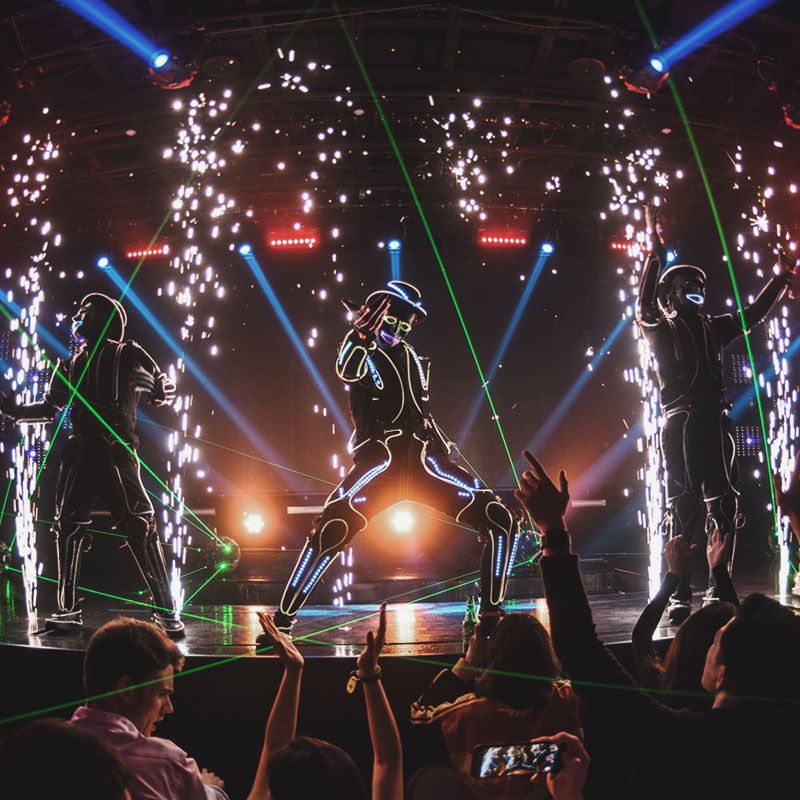
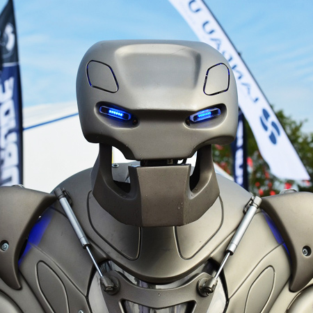
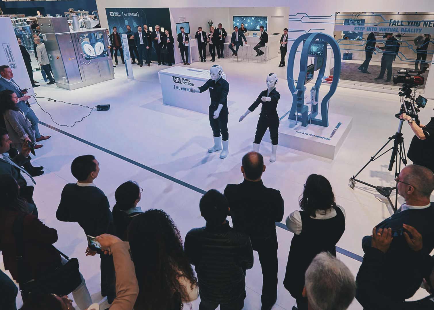
How can you use blue at your event? You can request some of our walkabout characters, robots or live events artists such as our speed painters to use blue to perform or create their artwork. You can see two examples below.
Green: peace, growth, health
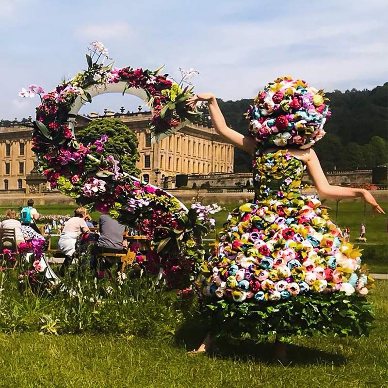
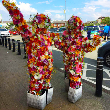
Starbucks, Animal Planet and Tropicana are a few of the brands that picked this colour for their logos. Even if it’s not part of your corporate branding, you can use green at a trade show, corporate event or store opening to communicate growth and health. Widely used for brands aligning their values to environmental causes, you can use entertainment such as the below characters or green walls to provide your brand with a fresh image, communicate your commitment with the environment or simply create a relaxation space at your conference.
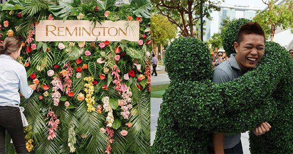
In the photo: Bespoke Fresh Flower Walls and Hedge People
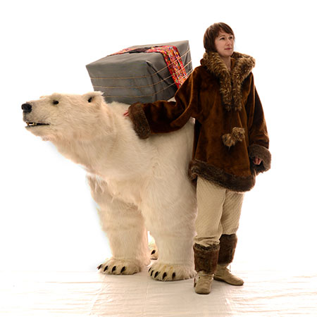
Grey/white: balance, neutrality, calm
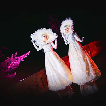
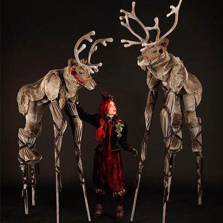
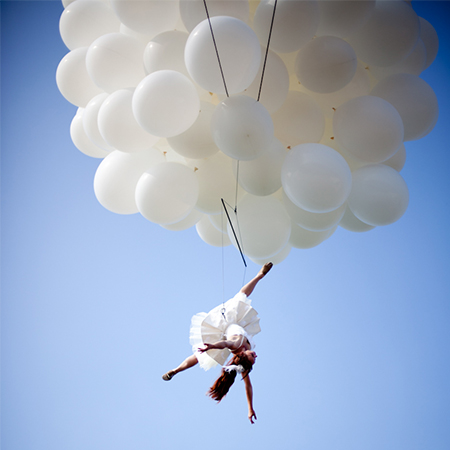
It’s not a coincidence that brands such as Apple or Mercedes Benz chose greys and whites as corporate colours. A symbol of goodness and purity, grey and white tones are strongly associated with balance, neutrality and calm. If that’s exactly what you’d like to communicate to your guests at your brand activation or event, then performers such as our human tables or stilt walkers can be the perfect choice for it. Also suitable for receptions and dinners, white characters invite you to relax, get away from your everyday routine and enjoy.
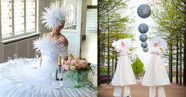
In the photo: Customisable Human Tables and Crystal Moon Stilt Walkers
Chromotherapy for Events: The Future of Wellness
Chromotherapy is a method in alternative medicine that uses the visible spectrum (colours and light) to achieve a person's physical and emotional wellbeing. Those who acknowledge chromotherapy claim colour, light, shape and sound can create a therapeutic environment.
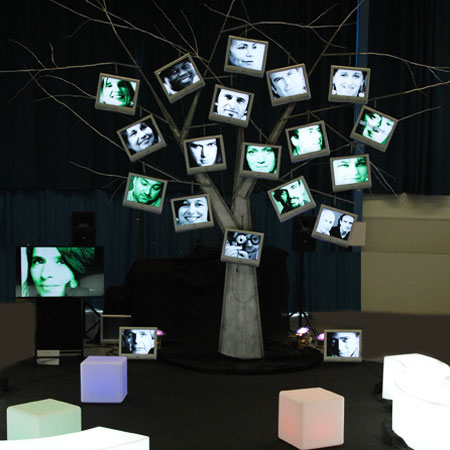
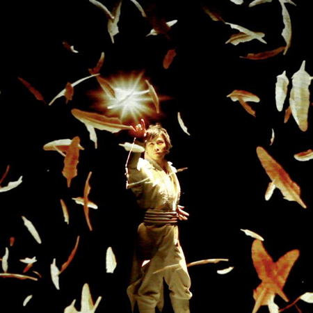
You can create a space to stand, breathe and reconnect the mind at your event, conference, trade show or any other type of occasion. For example, the below interactive installation enables an interplay between the conscious and unconscious levels of the psyche, stimulating the imagination and releasing creativity as it immerses people in a magic universe of light and sound.
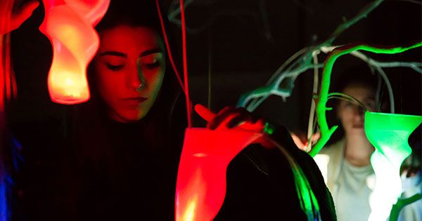
In the photo: Interactive Magic Forest
Are you familiar with colouring books? If you’re not, we encourage you to explore the concept and apply it to live events. If you are, you’re definitely going to love the below idea! The team of experts behind this project has taken colouring books one step further with a bespoke colouring backdrop that guests at your party will colour themselves. Bringing this trendy mindfulness technique to events of all types, colouring walls are another great example of brand experiences with colour: you can book the walls for your event, customise them with your logo and allow your guests to lose themselves in colouring them.
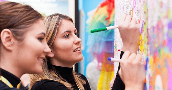
In the photo: Colouring In Walls
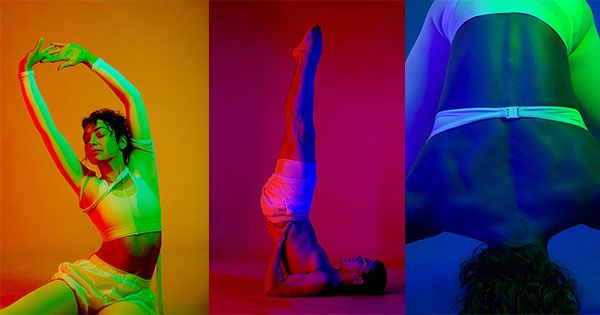
Last but not least, an interesting concept you can also get inspiration from is ChromaYoga. These innovative yoga experts and advocates of chromotherapy practice yoga whilst they experience colour. How? Each teacher guides their class through a set of sequences which correspond to the healing properties of one colour.
Explore Further Entertainment Options
If you would like to see more colourful ideas, we invite you to explore our article on bold colours for weddings and why they are replacing neutral palettes.
Have the above ideas aroused your curiosity? You can contact us to learn more about how colour influences decisions. Our Entertainment Specialists can help you create a monochromatic or multi-colour environment for your event depending on your needs and goals.
Colour Influences Decisions: Deliver Brand Experiences with Colour!
What colours do you associate with certain emotions? Unknowingly, we all link some hues to specific feelings, and that’s because we have subconscious reactions to colours. You can apply colour psychology to event marketing and make the most out or your brand activation or event by offering brand experiences with colour.
What is Colour Psychology?
First things first. Let’s start with a definition of the concept in question. Colour psychology is the study of hues as a determinant of human behaviour. According to Psychology Today, “the psychology of colour as it relates to persuasion is one of the most interesting - and most controversial - aspects of marketing”.
One of the reasons for this is the fact that many factors influence our perception of colours: our upbringing, experiences, personal preferences, cultural differences, context, etc. Therefore, many experts conclude colour perception is not a universal human experience.
However, there’s no doubt colour influences decisions. Even though our perception varies from culture to culture, Psychology Today also shared the conclusions of a study called Impact of Color in Marketing. In it, researchers explain that “up to 90% of snap judgments made about products can be based on colour alone (depending on the product)”.
Yellow: optimism, clarity and warmth
A colour chosen by brands such as Nikon, National Geographic or McDonalds, yellow is meant to convey optimism, clarity and warmth.
In the photo: LED Yellow Stilt Gentleman and Colour Stilt Walkers
This colour is also used by brands that aim for their target audience to remember their logo and message, as it normally helps people retain information. Associated to joy, energy and good humour, you can book entertainers who use this colour to stand out in an exhibition, quickly catch the attention of attendees at a trade show or make your guests remember your brand when the event is over.
Orange: friendliness, cheerfulness, confidence
A vivid colour used by brands such as Nickelodeon or Amazon, orange is generally perceived as a friendly colour. Also seen as loud and exotic, orange belongs to a palette of warm shades that communicate confidence and creativity.
We highly recommend booking performers making use of orange if you’re looking for a friendly character to welcome guests to your party, an entertainer who hands out samples of products or a performer that quickly catch the attention of attendees at a trade show or exhibition.
Red: excitement, youthfulness, boldness
Extremely popular, red is the corporate colour of brands such as Kellogg’s, Coca-Cola or Nintendo. Linked to excitement, youthfulness and boldness, red is a primary colour that we generally associate to passion, power and, in some cultures, to happiness.
In the photo: Danish Youth Guard and Red Rose Hostess
A colour that we at Scarlett Entertainment clearly love, you can book entertainers in red not only for brand activations, but also for special occasions such as romantic proposals, weddings and Valentine’s Day celebrations, but also if you’re looking for musicians that spread excitement and the desire to have a good time at Christmas parties, New Year’s Eve events, etc.
Purple/pink: creativity, imagination, wisdom
Generally associated with femininity, more and more brands tend to use purples and pinks. Among them, we can find T Mobile, Aussie, Taco Bell and, of course, Barbie. Purple and pink are colours that communicate creativity, imagination and wisdom. There are tones that we all perceive as delicate and sweet, which is the reason why it’s perfect to promote beauty brands at fashion shows or attract children’s attention at a shopping mall or festival, to name a few examples.
In the photo: LED Butterflies
Blue: trust, harmony, strength
One of the favourite colours among both men and women, blue is generally associated with trust, harmony and strength. That’s the reason why brands such as Facebook, HP or Ford picked it as their corporate colour. It also represents unity and peace, which is why entities such as the UN or the EU also use blue for their logos and flags.
How can you use blue at your event? You can request some of our walkabout characters, robots or live events artists such as our speed painters to use blue to perform or create their artwork. You can see two examples below.
Green: peace, growth, health
Starbucks, Animal Planet and Tropicana are a few of the brands that picked this colour for their logos. Even if it’s not part of your corporate branding, you can use green at a trade show, corporate event or store opening to communicate growth and health. Widely used for brands aligning their values to environmental causes, you can use entertainment such as the below characters or green walls to provide your brand with a fresh image, communicate your commitment with the environment or simply create a relaxation space at your conference.
In the photo: Bespoke Fresh Flower Walls and Hedge People
Grey/white: balance, neutrality, calm
It’s not a coincidence that brands such as Apple or Mercedes Benz chose greys and whites as corporate colours. A symbol of goodness and purity, grey and white tones are strongly associated with balance, neutrality and calm. If that’s exactly what you’d like to communicate to your guests at your brand activation or event, then performers such as our human tables or stilt walkers can be the perfect choice for it. Also suitable for receptions and dinners, white characters invite you to relax, get away from your everyday routine and enjoy.
In the photo: Customisable Human Tables and Crystal Moon Stilt Walkers
Chromotherapy for Events: The Future of Wellness
Chromotherapy is a method in alternative medicine that uses the visible spectrum (colours and light) to achieve a person's physical and emotional wellbeing. Those who acknowledge chromotherapy claim colour, light, shape and sound can create a therapeutic environment.
You can create a space to stand, breathe and reconnect the mind at your event, conference, trade show or any other type of occasion. For example, the below interactive installation enables an interplay between the conscious and unconscious levels of the psyche, stimulating the imagination and releasing creativity as it immerses people in a magic universe of light and sound.
In the photo: Interactive Magic Forest
Are you familiar with colouring books? If you’re not, we encourage you to explore the concept and apply it to live events. If you are, you’re definitely going to love the below idea! The team of experts behind this project has taken colouring books one step further with a bespoke colouring backdrop that guests at your party will colour themselves. Bringing this trendy mindfulness technique to events of all types, colouring walls are another great example of brand experiences with colour: you can book the walls for your event, customise them with your logo and allow your guests to lose themselves in colouring them.
In the photo: Colouring In Walls
Last but not least, an interesting concept you can also get inspiration from is ChromaYoga. These innovative yoga experts and advocates of chromotherapy practice yoga whilst they experience colour. How? Each teacher guides their class through a set of sequences which correspond to the healing properties of one colour.
Explore Further Entertainment Options
If you would like to see more colourful ideas, we invite you to explore our article on bold colours for weddings and why they are replacing neutral palettes.
Have the above ideas aroused your curiosity? You can contact us to learn more about how colour influences decisions. Our Entertainment Specialists can help you create a monochromatic or multi-colour environment for your event depending on your needs and goals.
22 August 2019
Scritto da:
Articoli più recenti nel Blog